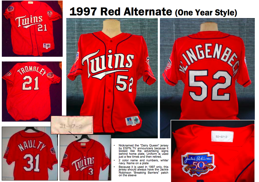
Ugliest Uniforms ever.
The White Sox have the shorts. The Astros have the orange rainbows. The Twins have the Dairy Queen tops.
In spring 1997, the bright red jerseys were ceremoniously introduced, along with the blue version, as the Twins installment of the money-making scheme that is alternate uniforms.

The Red Jersey was doomed from the start. If it had been Paul Molitor sporting the classy red top, perhaps its fate would have been different. But alas, it was Knoblauch - - which makes you wonder: who doomed whom?
Bad omen aside, the Twins first donned the uniform on April 6th against Kansas City. After finishing 78-84 the previous season, the team was primed for a playoff run in '97. So when they were clobbered 12-2 by the inferior Royals, they blamed it on the red alt jersey.

As the players decided to ditch the red tops altogether, the Twins marketing department insisted that they carry on the long standing tradition of wearing something different during Sunday home games. The team complied.
Despite a decent performance from Brad Radke and an amazing pinch-hit intentional walk by Ron Coomer, the Twins fell to the Rangers 7-3.
After just two games, it was all over. Not only were the Red Things now nicknamed "the Dairy Queen Jersey," but the Twins played slightly more horrible while wearing them. That was enough for Tom Kelly's Twins, and with their pennant hopes dashed, they banished the jerseys forever.
They'll go down in history as the worst thing a Twins player has ever worn on a diamond. Unless you want to count the Turn Ahead the Clock experiment from 1999. And I do.

Tuesday, June 23, 2009
The story of the Worst Twins Jersey Ever

Monday, May 11, 2009
Hey, did you know they played with pink bats yesterday!?!?!
Everyone loves Mother's Day. If you live near your mother it's a day where you get to go to brunch with the woman who birthed you, or if you don't live in the same zip code, you get to go and purchase a card and send it to her... um, tomorrow (sorry, Mom.) But the real enjoyment of Mother's day is getting to watch major league ball players swing uncomfortably with pink bats that they have never used before and wear over sized wristbands that look simply ridiculous.
Don't get me wrong, I am all for spreading the awareness of breast cancer. And I am all for the pink bats and the wristbands... for the players. I just think it's absolutely ridiculous that the every umpire yesterday wore two matching pink wristbands.
It has nothing to do with the color, it's ridiculous that there are umpires wearing wristbands at all. And two of them? That's just ludicrous. Good thing first-base umpire James Hoye has those wristbands on otherwise the sweat in his eyes would have prevented him from seeing that ball.
It was fair. Nice call Jim.
I know what you are thinking? "How are the umps going to show their support for breast cancer awareness?" It's simple, pink shirts and hats for the umps. I think it would be cool, and it might just cut down on the arguments. Then again, maybe not.
What do you guys think? I could see people saying pink umpires would be a distraction, but I say if anything, this would definitely spread awareness and it's certainly no more visually offensive than the Padres or AJ Pierzynski.
Monday, April 13, 2009
Say What?! New Twins Uniforms?
UPDATE: Pictures from the Uniform Unveil, November 16th.
Note: Here's the updated rumors


 7. A possible home alternate version of number 5 this one has piping around the sleeves and pants, along with the new M hat. (different than the infamous red alt uniforms of 1997)


Thursday, August 2, 2007
What Jersey Would You Want?
by Mark Waters
My goal over the next few years is to have a wardrobe completely full of sweet sports jerseys. So I've been compiling a list of jerseys I'd give anything to have. Now some of the following are almost impossible to obtain (cost me a pretty penny) but it's still fun to dream. So here it goes in no particular order.
DAVID ORTIZ TWINS JERSEY. 
As Much as it pains me to know that we could've won at least one championship had he stayed, I still would love to have his Twinkies jersey. There's something about jerseys of superstars before they were anything, especially when they played for small market teams. i.e. Carlos Beltran Royals, Gary Sheffield Brewers, Joe Nathan Giants, etc.
 HAROLD MINER MIAMI HEAT.
This pic says it all. He was the most electrifying player coming out of college, but has to be hands down the biggest disappointment in the history of sports. If you sported one of these anywhere in public, you would get at least a few, "wow, holy shit! You have the best jersey ever" comments every time.
ANY JERSEY FROM THE HARTFORD WHALERS ERA. 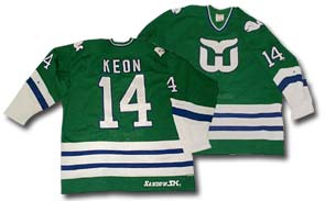
There's something about a momento from a team that no longer exists that gets me every time. Possibly the whole vintage, out of print, only will appreciate in value with age factor is what sparks my interest. Not to mention their old school logo, and green and blue colors are beyond tight. I just bought a sweet whalers t-shirt on ebay, and eventually I'll drop a cool 300 on a real jersey, solely raising my wardrobe grade up at least a full letter.
WILLIE MAYS MINNEAPOLIS MILLERS
In 1951, The Say Hey Kid played a grand total of 35 games for the Giants' AAA affiliate. During his extremely short stay in Minneapolis he hit .477. I'm guessing you'd have to break into a museum to obtain this piece of history, but man oh man, it would be worth it.
GOD SHAMMGOD UNIVERSITY OF PROVIDENCE FRIARS JERSEY
Not only does #12 have the coolest name in the history of sports, he completely tore it up during his run to the great eight in the 97 NCAA tournament. (it was called the great eight in 97, why did they have to change it to elite eight?)
He did virtually nothing in his short lived career with the Bullets, but this dudes name, and mean crossover made him immortal.
SATCHEL PAIGE CLEVELAND INDIANS JERSEY 
One of my favorite players in baseball's history. His influence on getting black players to play in the majors, a shoe in hall of famer, and his stories that could fill a book the size of the bible, Satchel was one of the most interesting athletes in the 20th century. I urge you all to read his bio on wikipedia and to read the book "Don't Look Back: Satchel Paige in the Shadows of Baseball"
So there you have it folks. If the ladies or gentlemen reading this have any jersey's that you'd love to have, please comment.